I'm sure that most of us have seen the selective attention video of counting basketball passes and the gorilla. If you haven’t, why don’t you try it on your team at the dental office.
Our brains constantly shorthand data. So what does this have to do with your dental office design? A lot actually!
We need to understand how dental patients perceive space
When I started the journey to become the designer of the best dental offices in the world 30 years ago, I knew that the Psychology of Spaciousness mattered. But I wasn’t sure how to combine that with the goal of building the most productive dental offices on earth. Aren’t the two working in opposition? The good news is that these two objectives can be and must be reconciled to create the ultimate dental practice.
Here’s the challenge. High productivity actually requires a certain compactness of space. Let’s think about this for a moment. You could argue that the extreme compactness of a fighter jet cockpit or a Formula One seat are driven primarily by aerodynamics. But even the simple controls in NASCAR aren’t spread all over the dashboard!
Another comparison would be a professional kitchen. Do they lay it out like your dream show-off kitchen? No way! What you need is as close as possible to where you use it! This is central to our core principle - “You can’t use what you can’t reach!”
So what does this tell us about what to do in practice? To answer that we need to understand how people perceive space. What makes things look and feel bigger than they are and what makes them appear smaller? It’s a science. Without subjecting you to the details from the decades we've studied this, I’d like to give you a few of the important principles that define how humans visually process space, so that you can make your offices better too.
The Psychology of Spaciousness in dental office design
First, when we enter a room, we don’t have a laser transit in our brain. We can’t actually measure a space. But we perceive the size of a room by the amount of open floor space that we can see. So the more busy crap and cabinets and furniture that take up floor space, the smaller we think the room is due to visual constraints. That’s why a wider room with side cabinets feels much smaller than a narrower room without.
Second, the depth of a room is largely determined by the brightness of the far wall. Brightness makes it appear closer. That could be manipulated in a couple of ways. For example, from the patient’s perspective, you don’t generally want them to have the room feel endless. As a patient, you are going to be lying flat and vulnerable, so a certain amount of enclosure is actually good. However, if you were trying to make an interior treatment room with no windows feel appealing you might want to brighten up that wall with lighting, artwork, or perhaps a very large monitor.
The third factor is this. If an area feels cramped, you can make it appear longer if you can intentionally and progressively reduce the size of artwork, displays, or furniture as you move further away. This will greatly enhance the sense of length.
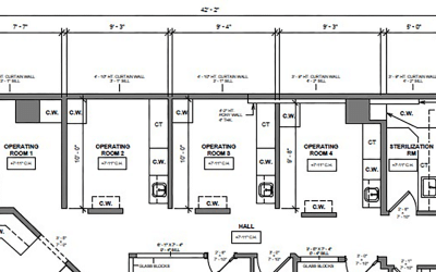
A more common problem in the dental practice is long narrow hallways that you want to make feel shorter. We work really hard to minimize these in the way we design your dental practice. But we are also lucky enough to design some really big practices! So the tools to make larger hallways appear shorter are very helpful. One principle is to try to not enter the hall on its end. Reroute the crossover hallways into a more central starting position so that you wind up with what feels like shorter hallways.

A crossover hallway (center area of floor plan above) can help make hallways feel shorter.
Using this visual shortening technique is more challenging if you are putting your office in a strip mall. Here you will use a combination of increasing brightness and a focal point terminal display to shorten the perceived length. You can use these perceptual tricks to shorten the perceived length by about 25%. That’s often enough to make the office feel less clinical.
The last very important principle that allows a great opportunity for creating an emotionally successful treatment room design relates to the sequence of how we (as the patient) read a treatment room visually. This is where our early work with magicians comes into play. Early in this process I actually hired one of the best magicians in North America. Someone who had performed at places like the Lincoln Center. Not a jokester type, but rather a classical illusionist. Think about it for a minute. If you now understand the principles of productivity you know that we need a more compact space to work efficiently on the smaller space of the mouth but that you also need to have plenty of space for supplies - at your fingertips. Yet you still need to have the room feel spacious! Can you now see why we get very picky on our recommendations regarding how you fit out your dental offices?
So how do people actually read a room? Here’s how.
When we enter a new room our eyes move in this pattern in 1/ 10th of a second!
This is how we can slip that gorilla into the that video, or how our magician has you overlook something obvious in their trick. You see, the field of view that we take in during that initial scan is only 30° to the left and then very well defined after that. So by consolidating and pushing any scary, busy, or objectionable stuff out of that range of view we have bypassed your patients fear circuitry. If, in addition, you can push the dental light up and out of view (you do this with a track) and have an attractive end wall to catch the patient’s focal interest you will have bypassed the fight or flight mechanism!

This treatment room is less than 9-feet wide yet appears expansive.
This sets the stage for case acceptance. This sets the stage for a relaxed patient in treatment. This sets the stage for in-room consultation.
So I’m thinking that this might also be a good time to clarify a misperception about my opinions regarding handpiece placement. It has been said that I am opposed to over-the-patient handpieces. Not true. They are the most familiar placement for graduating dentists. Schools use them because, for all the money you spent in dental school, they are still too cheap to give you a dental assistant. So you learn to grab everything by yourself for that one and only procedure you are doing. You probably have enough room on the bracket tray for that. In addition, over-the-patient handpieces are the second most efficient placement location. In general. But they also are the second most expensive installation and they entirely screw up the concept of patient emotional security through the principles I’ve laid out here. Think about where they wind up in that fight or flight grid. This greatly reduces success at in-room consultation and, for me even worse, prevents the use of surgical tables for performing surgery, sedation and big cases.
So before you commit to the details of office design consider the Psychology of Spaciousness and how your dental office design decisions affect patient comfort. You’ll be glad you did, and at least you’ll be clear about the trade-offs that you’re making with whatever you decide to set up
Also, please don’t hesitate to contact us should you wish to learn more about how to create the most productive, comfortable, patient friendly and cost-effective dental practice.