Great design leans heavily on psychology, aesthetics, business sense, and an acute understanding of our industry. While much of this work is qualitative, there is a system to it, with quantifiable criteria to gauge the effectiveness of a dental office design.
Over the last 25 years of designing exclusively for the dental industry – and maintaining two flourishing practices – my team and I have codified the most important of these criteria into our 17 Elements of an Ideal Floor Plan. While these 17 Elements don't hold the key to every dental office design consideration, they do inform the most important, and impactful, decisions we make with our design clients.
The first of these elements is one that sounds deceptively simple: Create a clearly identifiable patient entrance.
Start with a clear and welcoming dental office entrance
It's a common problem that we have all experienced; trying to find an entrance door to a business can be confusing, and walking up to a locked door, or accidentally entering the wrong door, is embarrassing. A proper design will minimize this confusion by creating an entrance that is a clear focal point of the building façade for your patients to enter. This increases the likelihood that your patients will arrive at the front desk in a good state-of-mind and receptive to treatment. Patients shouldn't be confused by a nearby staff entrance ... or the doorway to an adjacent, unrelated business.
Some examples - bad and good
 |
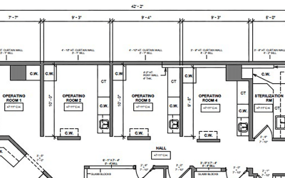
A traditional approach that fails to bring the best benefits possible, by missing opportunities or creating bottlenecks & disorganization, versus... |
 |
Design Ergonomics plans that are geared to optimize practice efficiency and enhance the patient, staff, and doctor’s experience |
The handicapped parking and striped walkway in Photo “A” below visually lead patients AWAY from the main entrance and direct them toward a staff entrance/patient exit. A lack of clear signage makes this even more confusing.
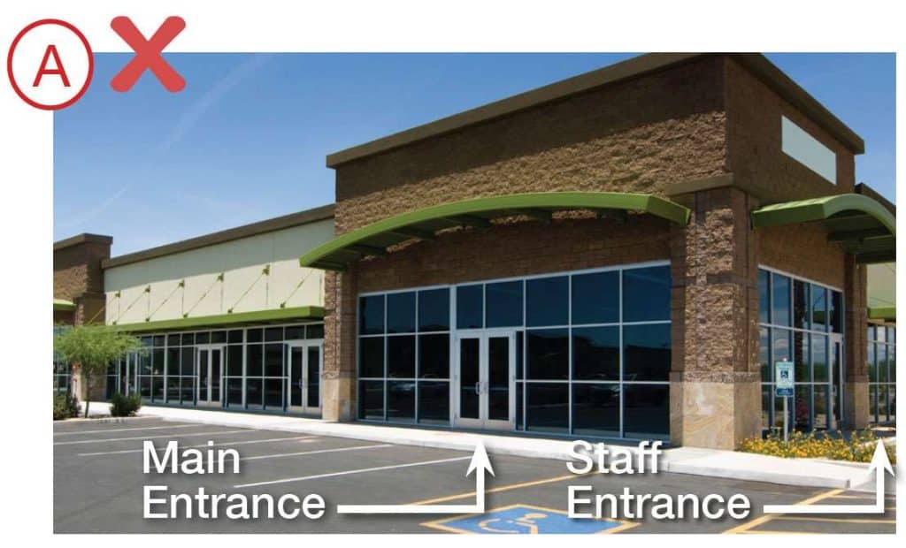
This "main" entrance is confusing for dental patients
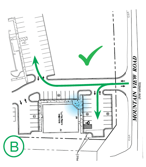
In contrast, in Photo "B" below, the roof lines, prominent columns, and signage all face the bulk of parking and help identify the proper entrance.

A clear dental office entrance creates a positive patient experience from the start
Entrance considerations can and should be addressed at the site plan level as well. This is shown in the two plans below, which are alternate design approaches to the same site.
| CONFUSING: In Plan "A", the entrance, highlighted in blue, is removed from the initial traffic approach and hidden from the majority of the parking in the upper right. |
A BETTER SITE PLAN: In Plan "B", the entrance, highlighted in blue, is placed on the corner of the building. Placed here, it is not only prominently visible on initial approach, but it can be seen from both main parking areas as well. |
 |
 |
For more dental office design inspiration, take a look at our dental office design portfolio. If you have any questions, please reach out to my team at Design Ergonomics.