
If you’re planning, building, or redesigning a dental office, you’re probably asking some version of the same questions every doctor asks:
- What actually makes a dental office efficient?
- Why do some practices feel calm, productive, and profitable… while others feel chaotic?
- And how do I avoid expensive design mistakes I can’t undo later?
Here’s the truth most people won’t tell you:
Not all dental office designs are created equal, and the difference isn’t just aesthetic. It’s measurable. It affects your production, your team’s performance, your patient experience, and ultimately, your long-term success.
After decades of designing dental practices, we’ve learned that great design isn’t subjective. It follows a set of principles that consistently produce better outcomes.
In this article, we’re going to show you exactly what those principles are.
No fluff. No vague ideas. No “it depends.”
Just the 18 specific, proven elements that separate an average dental office from one that truly performs at a high level, for both patients and dental teams.
If you’re making decisions about your space, this is the framework you want to understand before you commit time, money, and square footage.
Because the right design doesn’t just support your practice…
It defines what your practice is capable of becoming.
1. Clearly Identifiable Patient Entrance
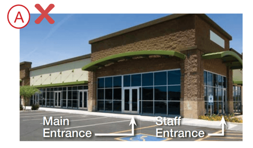
It is a common problem that we have all experienced: trying to find the entrance door can be confusing and walking up to a locked door or accidentally entering the wrong door is embarrassing.
If a patient has to slow down, look around, or guess where your front door is, you’ve already introduced friction before they even step inside.
That moment matters more than most doctors realize.
Confusion at the entrance creates uncertainty. And in this setting, uncertainty can quickly turn into anxiety.
A high-performing dental office removes that friction completely. The entrance should be unmistakable: a clear focal point of the building that patients can identify immediately from the parking area.
When this is done right, patients walk in feeling confident and oriented.
When it’s done wrong, they walk in slightly uneasy, and that feeling follows them into the appointment.
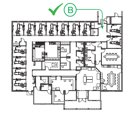
Entrance considerations can and should be addressed at the site plan level as well.
The entrance on plan “A” (highlighted in Blue) is removed from the initial traffic approach and hidden from the majority of the parking in the upper right.
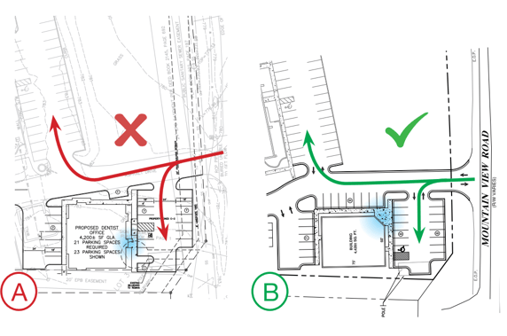
A BETTER SITE PLAN:
In design “B”, the entrance is placed on the corner of the building (highlighted in blue). Placed here, it is not only prominently visible on initial approach, but it can be seen from both main parking areas as well.
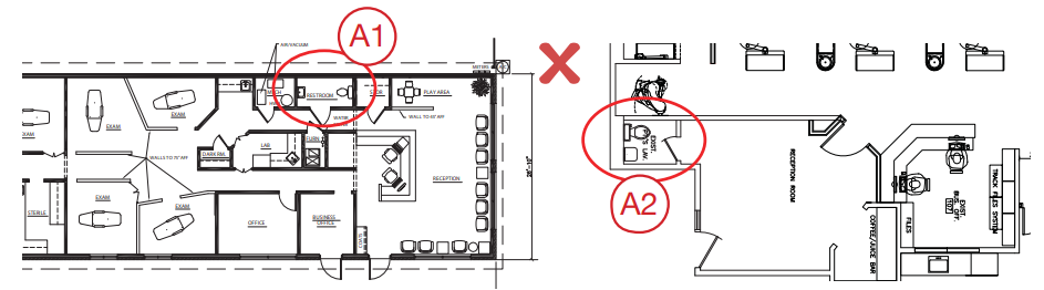
2. Staff Entrance Screened from View
Patients are constantly forming impressions. Not just from what they see, but from what they shouldn’t see.
When staff members are entering and exiting through the same visible doorway as patients, it blurs the line between “front stage” and “backstage.” The result? A subtle loss of professionalism and authority.
A separate, discreet staff entrance, typically located on the side or rear of the building, keeps the patient experience focused and controlled. It also gives your team privacy and a more functional flow in and out of the building.
Think of it this way:
Your practice is a performance environment. Patients don’t need to see everything happening behind the scenes.
When you control what’s visible, you elevate how your practice is perceived
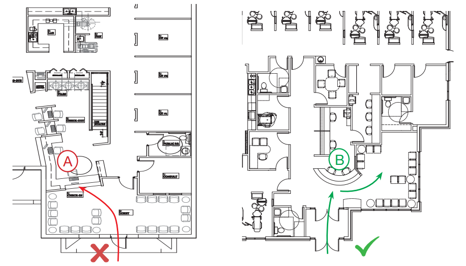
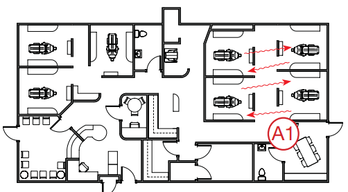
No entry should ever be placed inside a treatment room or bay, as was done in the plan shown below (entry “A1”). This should be used for egress only. In this case, the ONLY reasonable entry is the primary patient entry (“A2”) – not ideal for you and your staff.
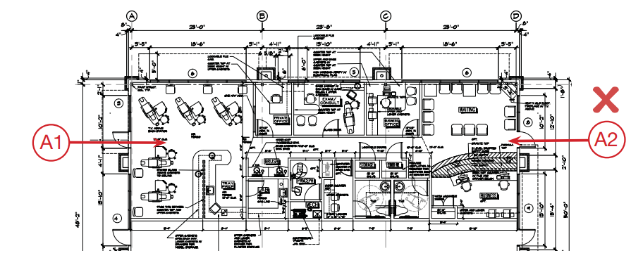
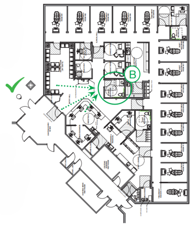
A BETTER LAYOUT: The staff entrance shown here (“B”) is more suitably located. It is on the back face of the building and provides quick access to the staff lounge with minimal exposure to treatment rooms
3. Immediate Visual and Physical Access to the Front Desk
When a patient walks through your door, they should never have to ask:
“Where do I go?”
If the front desk isn’t immediately visible, you create hesitation... and hesitation creates discomfort.
This is one of the most common design mistakes we see.
In a well-designed practice, the front desk is the natural next step. Patients should see it instantly and be able to walk to it without having to make eye contact with a sea of unfamiliar faces in a waiting room.
We create an inviting environment by positioning the front desk directly in clear view and removing physical barriers, while placing waiting chairs off to the sides.
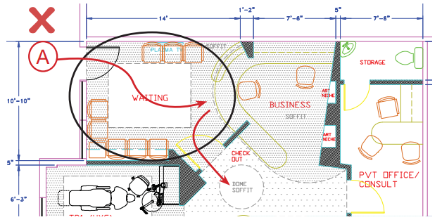
In Example “A”, you see that the front desk is hidden from the patient’s view upon approach. Not only will this confuse the patient, but it prevents front desk staff from seeing the patient arrive.
In contrast, the front desk “B” is visible from the outside of the building. The addition of a vestibule alerts staff of patient arrival so that greeters can be ready and focused as the patient approaches the desk without barriers. A similar effect is possible with a front desk located directly adjacent to the entrance as shown above.
4. Reception Area Seating Removed from Primary Traffic Flow
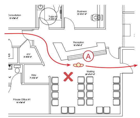
There is a principle that is basic to both design and human nature: seating and circulation don’t mix.
If patients have to walk through the middle of a seated group just to check in or head to treatment, you create unnecessary tension. No one likes feeling watched, interrupted, or in the way.
Yet this mistake shows up in practices all the time.
Our reception area layouts provide a clear path for approach and patient circulation that does not impinge upon the seating area (“patient lounge”).
This separation creates a more comfortable space by limiting interaction with other patients and avoiding the need to ask someone to move so they can walk past.
It’s a small shift in layout...but it has a big impact on how your space feels.
In this layout, patients entering at “A” are required to walk down the center of the seating area. Their first impression of your office won’t be a smiling greeter – it will be another patient, who might not be in a smiling mood.
A BETTER LAYOUT: Patients arriving through entrance “B” have immediate access to the front desk and an unrestricted path to a pleasantly removed seating area – and from there, a clear path to clinical.
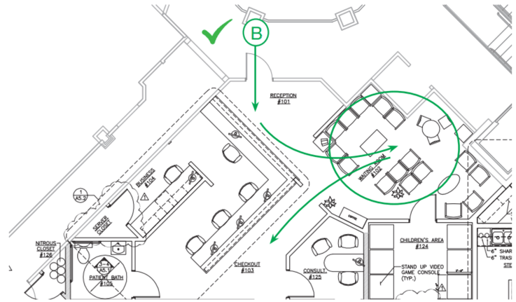
5. Patient Bathroom Visible To – But Removed From – the Patient Lounge
Patients should feel welcome to use the restroom, not embarrassed by having to ask where it is, or hesitant because it’s located in the middle of the reception area.
Yet for safety, customer service, and general patient-flow awareness, your front desk staff should also be able to easily monitor restroom use from their workstation.
To accommodate these needs, we place facilities in a location that provides your patients the sense of privacy they desire, yet allows your greeters line-of-sight control. This will keep patients from having to enter too deeply into the clinical areas while preventing the distraction of constant interruptions to your front desk staff.
Restroom “A1” above is invisible upon entering reception and is relatively hidden to the majority of the waiting room.
And while the facilities in “A2” are visible to both patients and the front desk staff, it is so centrally located in the waiting room that patients may be reluctant to use it.
A BETTER LAYOUT: The dotted sight lines in this design clearly show that Restroom “B” is:
1) Visible on entry
2) Easily monitored by the front desk
3) Visible from much of the patient lounge
4) Positioned away from chairs for privacy, but is not located deep within the clinical area
Beyond accommodating the patient experience, ideal restroom location helps keep your schedule running on time; patients are less likely to wait and ask to use the facilities on the way to the treatment room.
6. The Major Proportion of the Front Desk Does Not Face the Patient Lounge
Most front desks are designed for one thing: visibility.
But that’s only half the equation.
Your front desk also needs to function as a place where sensitive conversations happen. Finances, treatment plans, and personal information. If everything faces the waiting room, there’s no privacy, and that creates discomfort for both patients and team members.
The best designs strike a balance.
They provide:
- A clear, welcoming point of first contact
- A more private area for checkout and conversations
- Space for your team to work without constant interruption
To accommodate these needs, the majority of the front desk face will be separated from the patient lounge.
This creates a clear greeting location while providing the privacy desired for check-out and a space to work largely undisturbed.
To further accommodate patient comfort and team privacy, we typically incorporate an open bar-height counter for patient interaction. This counter will not only be comfortable for your patients to walk up and talk with your team, but it will shield any work on your team ’s desk.
Front desk “A” provides zero opportunity for private patient interaction (checkout, financial concerns, etc.) and forces patients fresh out of treatment to walk past the entire waiting room. Furthermore, all seating exposes your entire front-end staff to unending interruptions which decreases focus and productivity.
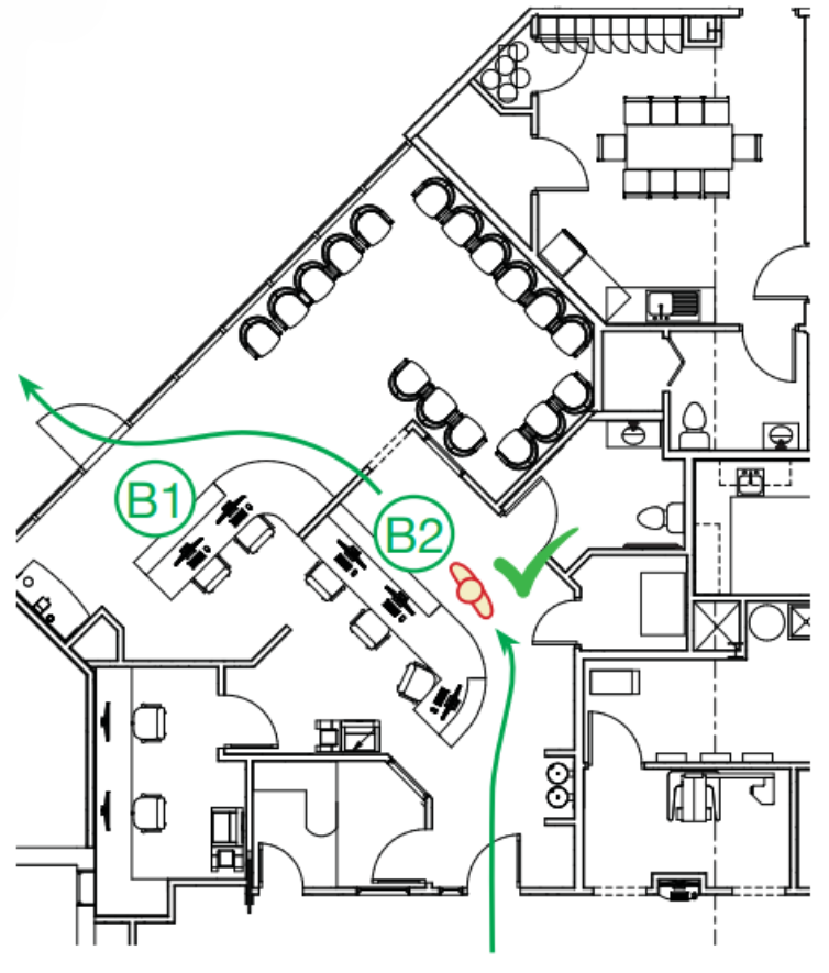
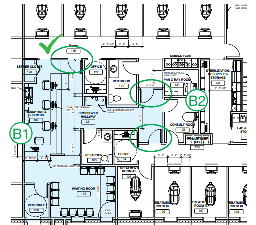
The layout shown above demonstrates a much more effective design. The greeter’s station (“B1”) faces the entry and is easily accessible from the patient lounge, while the majority of the front desk (“B2”) is removed from these spaces. This creates a checkout area with much more privacy for both patient and staff alike. Also note that while patient-facing areas “B1” and “B2” are separated, staff movement between the two stations is unrestricted, allowing for extreme efficiency.
7. Treatment Rooms Isolated from the Front Desk
If your reception area can hear what’s happening in your treatment rooms, you have a problem.
And more importantly... so do your patients.
The sounds of a dental office can be unsettling, especially for anxious patients. At the same time, your front desk team needs a quiet environment to communicate clearly with patients, both in person and on the phone.
When these spaces are too connected, both suffer.
That’s why we intentionally separate “front of house” and “clinical” areas using doors, transitions, or strategic layout decisions that reduce sound transfer.
We will create a plan for your office that separates the treatment rooms from the front desk in order to minimize the sounds from both regions interacting.
We accomplish this by placing a door or cased opening between the reception and the clinical areas. We also try to group treatment rooms, away from the front desk, improving isolation and clinical efficiency.
NOISE TRAVELS: While this design may employ doors to separate the waiting area from clinical, the open nature of front desk “A” will allow treatment room sound to reflect throughout all of reception as shown. Additionally, patients’ conversation at checkout will be overheard in the first two treatment rooms, negatively impacting privacy for both patients and staff .
BETTER SOUND ATTENUATION: By moving the treatment rooms further away from reception desk like those shown above in “B1”, we can use doors (circled) to completely isolate the clinical area from the patient lounge. Physically separating “front of the house” activities and spaces (shaded in blue) from the “back of the house” creates a more comfortable environment for both patients and staff. Note that this design also utilizes “front” and “back” entry points for consult room “B2”, giving more flexible access.
8. Consultation Room Location Minimally Exposes Patients to Treatment Room Activities
For many patients, the most important conversations don’t happen in the operatory... they happen in the consultation room.
But if getting to that room requires walking past multiple treatment bays, hearing equipment, or seeing procedures in progress, you’ve already increased their stress level before the conversation even begins.
We provide an entrance for your patient that avoids the view of the treatment rooms and reduces the impact of treatment sounds. Through this, we will provide you with a quiet space in which you can speak with a relaxed, comfortable patient.
This design consideration is especially beneficial to your more apprehensive patients.
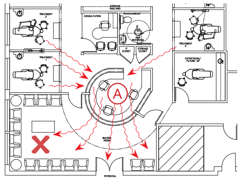
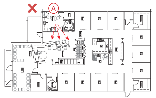
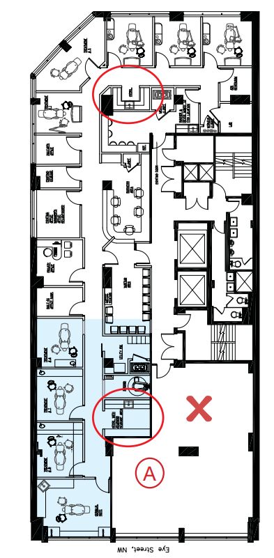
In the design shown above, both the consult room and checkout directly face treatment rooms. This reduces privacy and increases exposure to operatory noise. Furthermore, the patient is required to walk by multiple treatment rooms to access the consult room in the first place.
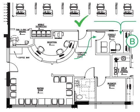
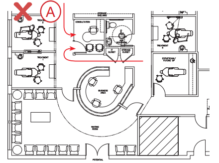
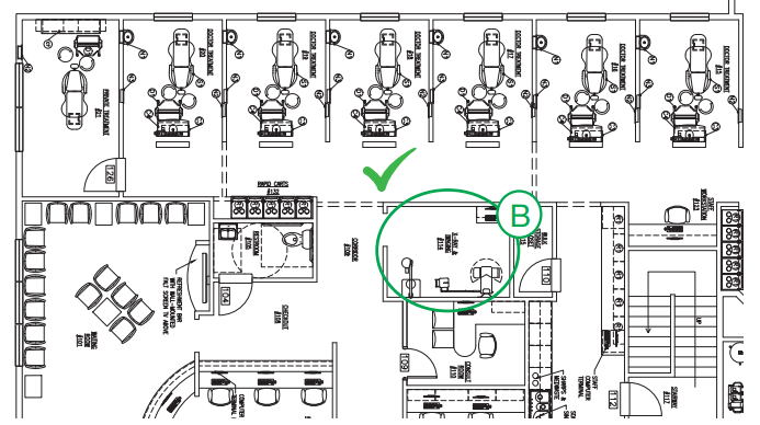
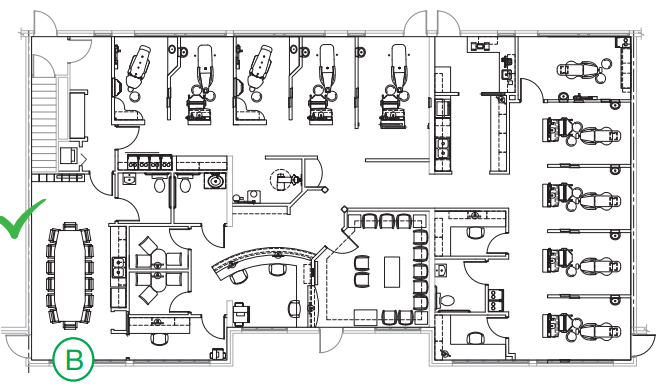
A better layout: Here, the entrance to consult room “B” is outside the clinical area, and directly adjacent to checkout. This allows apprehensive patients to enter the consult room without ever seeing a treatment room. Note that the layout also includes a secondary entrance, which allows doctor access from the main clinical hallway. This eliminates the possibility of being trapped by a patient at the front desk or checkout, as described in Element 9, below.
9. Consultation Room Accessible by the Doctor Without Passing through the Front Desk Space
When you have to pass through the front desk or patient lounge to get to the consultation room, you're constantly exposed to interruptions, quick questions, casual conversations, or patients trying to engage.
Individually, these seem harmless. Collectively, they disrupt your schedule and reduce efficiency.
A better approach is simple:
Your consultation room should be accessible from the clinical area, not just the front.
This allows you to enter and exit on your terms without unnecessary friction.
Having a positive, friendly relationship with your patients is important – but you are on a time-limited schedule.
We place our consultation rooms in such a way that you can go about your tasks without being stopped by a patient to chat in the hallway or in the front office area.
You stay in control of your schedule, making time for patient conversations only as you see fit.
10. Treatment Room Alignment Does Not Channel Noises from Room to Room
Sound travels... and in a dental office, that matters more than most people think.
Depending on your patient’s level of apprehension, the sounds of a dental office can range from distracting to terrifying.
When treatment rooms face each other or align directly across corridors, they create a channel for noise. Conversations, instruments, and equipment all carry further than intended.
Controlling how sound travels will be critical to their comfort. A relaxed patient is easier to work on and is more likely to accept treatment. To do this, we typically avoid locating rooms across from each other.
This consideration need not subtract from the organization or workflow of the office; rooms can be arranged along corridors or facing non-clinical areas – rather than other treatment rooms – while still maintaining a smooth, consolidated flow. If rooms must oppose one another, we will create isolation for them (typically via doors).
Both “A1” and “A2” present significant issues with sound attenuation (control and reduction). Placing dual entry headwall operatories directly across from one another channels a large number of clinical sounds, conversations, and everything. Even rooms on adjacent corners (“A2”) or facing long hallways create paths for direct sound travel.
To better control sound, layout “B” places most operatory openings across from a corridor wall or non-clinical space. Where opposing rooms were required (the highlighted operatory), doors were included. This handles both sound attenuation and creates a private suite (for surgical, sedation, etc.)
For more information on this element, check out this article.
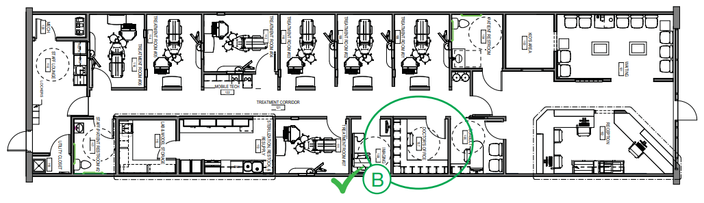
11. Sterilization, Lab, and Resupply Areas in Close Physical Proximity to Treatment Room
Every extra step your team takes is time lost.
If sterilization, lab, and supplies are scattered or too far from treatment rooms, those small inefficiencies add up quickly over the course of a day.
That's why our designs are based on office-centric principles in which sterilization, resupply and bulk inventory are centralized. (This is in contrast to a room-centric approach in which a practice attempts to keep months' worth of redundant supplies for all procedures in each operatory.)
This central area becomes the hub of clinical support. As such, it should be located as close to the treatment rooms as possible, to reduce travel time between these frequently visited spaces.
While centrally located, we will make these spaces as private as possible without taking away from their functionality, so that they will be unnoticeable to your patients.
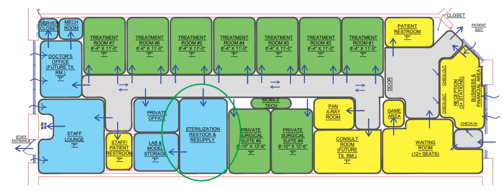
The size of your practice will dictate the optimal size for central sterilization and resupply. For larger practices (15+ operatories), the area should be located between the two clinical “halves” of the office and create entry points from either side. This also serves as a pass-through corridor for staff and may be used for a quick, semi-private conversation out of patients’ view. We will typically “pocket” the lab off sterilization and resupply to help mitigate sound.
12. Treatment Rooms Should be Spacious, but Space-Efficient, Maximizing Both Productivity and Patient Comfort
The best operatories focus on two things:
- Patient perception of space
- Clinical efficiency
That is why we design treatment rooms that reduce patient anxiety by placing clinical supplies and instruments out of patients' immediate view. We also avoid bulky cabinetry, leaving the floor open and uncluttered.
The operatory layout should be streamlined to improve clinical function as well. We consolidate delivery needs at the zone of production, placing all required instruments and supplies within reach of both doctor and assistant.
The result is a treatment room that feels more spacious, while simultaneously providing enhanced ergonomic efficiency in a much smaller footprint.
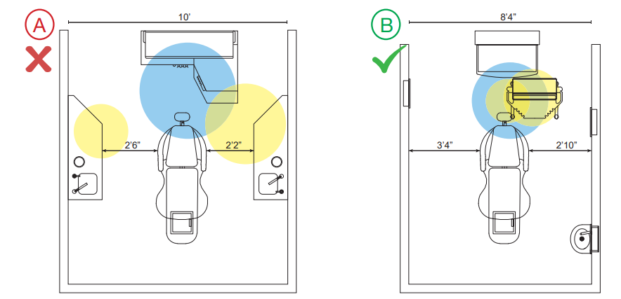
Figure “A” shows a typical 10-foot-wide treatment room. In this layout, the clear floor area between the cabinets is actually less than 5 feet wide. This makes mobilization, sedation, in-room checkout and consultation largely impractical. It also feels more congested to the patient.
Layout “B” increases obstruction-free floor-width by a foot-and-a-half, while actually reducing overall room width. Psychological studies have shown that increasing the volume of clear floor-space makes the room feel much more expansive. As an added benefit, it also allows for better mobilization of technology (Element 15).
Also note the reduced size of the work area required for treatment. In operatory “A”, both doctor and assistant are forced to reach behind or to the side for supplies, as shown in the shaded areas. In operatory “B”, supplies have been removed from the side-cabinetry and placed near the “zone of production” (i.e., the patient’s mouth). This greatly reduces the range-of-motion required to perform treatment, which eliminates ergonomic stress on the body and significantly enhances production speed.
13. Compact Treatment Area Minimizing Segregation of Doctors and Hygiene Staff
If your operatories are spread across the entire office, your team is constantly chasing efficiency.
When treatment areas are not compact, rooms tend to wrap around corners, get stuck on remote islands, and wind up too close to the front desk area. Long walks between rooms, supplies, and sterilization create delays, making it harder to stay coordinated.
Consolidating operatories into a single area (or multiple treatment zones for very large practices) results in a much more efficient use of total space by reducing or eliminating unnecessary hallways and “lost” spaces.
By consolidating operatories into a unified zone:
- Travel time is reduced
- Communication improves
- Supervision becomes easier
The contrast between these two plans demonstrates the benefits brought by consolidating treatment rooms.
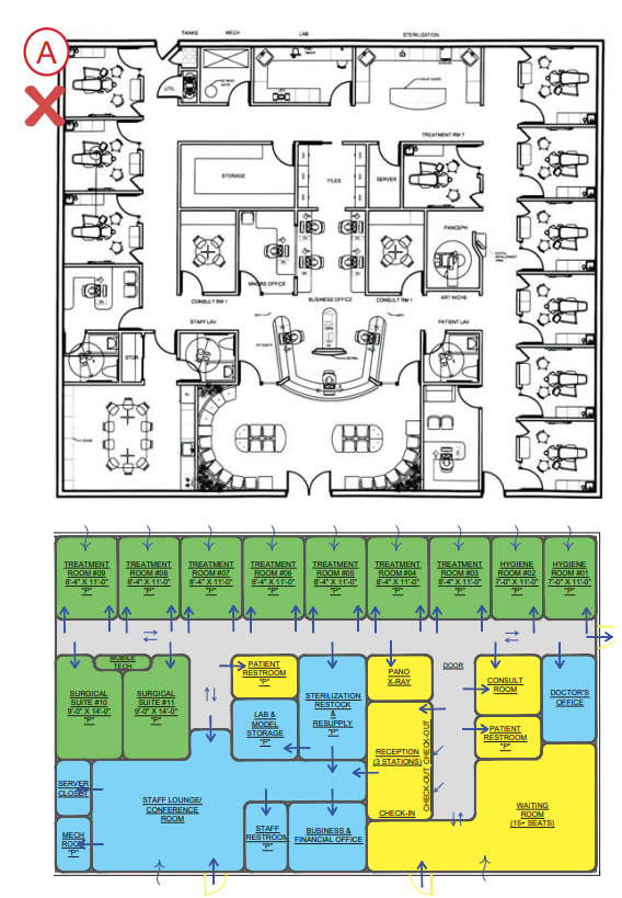
CONSOLIDATE FOR IMPROVED FLOW: Plan “A” spreads operatories across nearly the entire footprint (3 out of 4 walls). In version “B”, all operatories are consolidated along a single corridor. This significantly reduces staff travel time from room to room and more importantly, from ops to sterilization and resupply. In an eight-hour day, this can have a large impact on productivity.
CONSOLIDATE FOR SPACE EFFICIENCY: Plan “A” utilizes over 4800 sq. ft . to create 10 operatories. In contrast, “B” requires only 3500 sq. ft . to create 11 ops. Consolidating operatories allows us to eliminate wasted hallway space while improving travel efficiency.
The result is a 27% reduction in total size (and significant savings in construction costs), while providing a 10% increase in capacity. The design also provides a much more efficient flow, given that mobilization of technology (Element 15) allows any treatment in any room at any time, and the widening of effective operatory floor space (Element 12) provides for comfortable in-room consultation and checkout.
14. Doctor’s Office Within Proximity of Treatment Rooms, Permitting Doctor to Keep a Pulse on Clinical Activities
Your private office should do two things well:
- Give you a place to step away and regroup
- Keep you connected to what’s happening clinically
All too often, it is treated as an unrelated amenity and simply placed wherever it “fits.” Your office should be a safe zone, an area to retreat & regroup – but it cannot be so far away that you lose the pulse of ongoing activity in your practice.
We will place your private office in a location that keeps you in tune with your staff’s activities and maintains easy access to patients, while also providing a quick retreat with minimal effort.
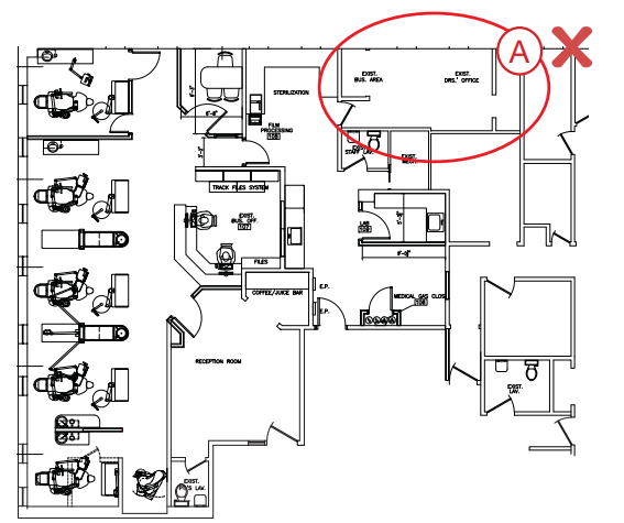
Office “A” is far too removed from the clinical area, even for a smaller office of this size. Furthermore, accessing operatories will run right past checkout, where you are likely to be stopped by patients
BETTER DESIGN: Office “B” has easy access to treatment rooms & consult, but does not require passing through checkout to do so.
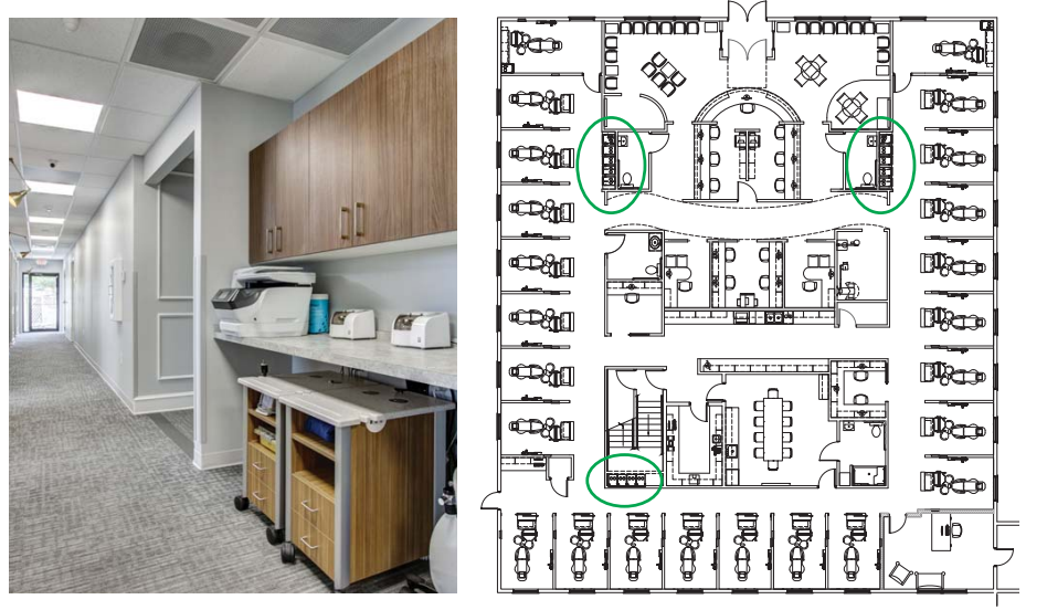
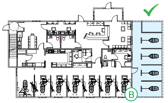
15. Space for Mobilization of Technology
Mobilizing technology and specialty equipment is one of our core efficiency principles. Technology is one of the biggest drivers of efficiency, but only if it’s easy to use.
When equipment is locked into specific rooms or awkwardly stored, it slows everything down.
For effective and rapid deployment, mobile technology should be “parked” in a central location outside the treatment rooms when not in use. We typically incorporate “mobile bays” into our designs (below). To present a clean, uncluttered look, we design these bays as recesses, often with storage above, so they fade into their surroundings.
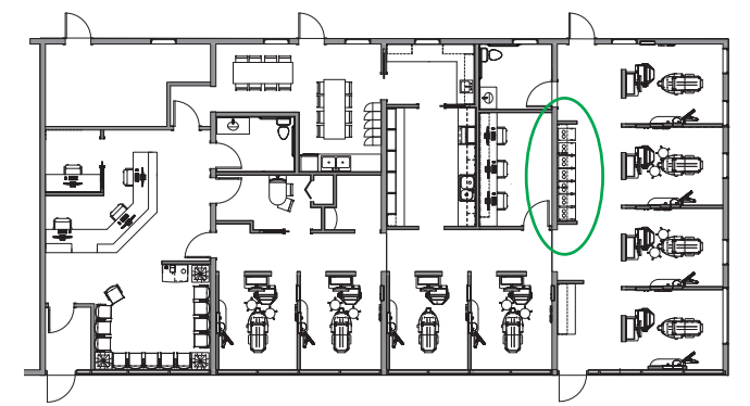
Mobile Deployment Carts may be used to eliminate the duplication of expensive equipment, or to provide a quick response to infrequent procedural needs (e.g. endo). Depending on the size of your practice, you may require one bay or several (bottom right)
16. Imaging Areas Do Not Block Traffic Flow When in Use
Imaging is essential. But poorly placed imaging can disrupt your entire clinical flow.
A common mistake is placing imaging units in hallways or open areas. This creates:
- Traffic bottlenecks
- Privacy concerns
- Potential safety issues
For these reasons, we incorporate a space for this unit that remains centralized but is either enclosed or isolated. imaging should be:
- Centrally located for easy access
- Properly enclosed or shielded
- Positioned so it doesn’t block movement when in use
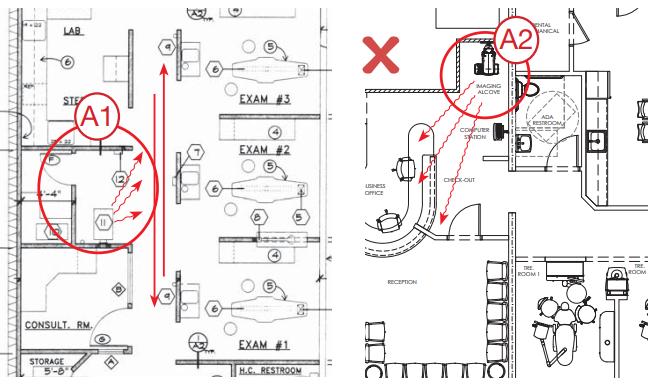
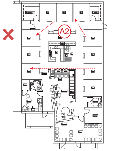
X-ray placement “A1” is open to the main clinical hallway. Staff will be reluctant to walk by when your pan is in use. Placement “A2” shows an unshielded X-ray in close proximity to the front desk. This can create a long-term health hazard.
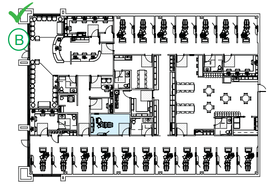
In contrast, the placement of the imaging area shown in example “B” provides a central location that allows for shielding and privacy, yet will not restrict patient and staff flow.
17. Staff Lounge Isolated from Clinical and Business Zones
We believe that the staff lounge should be truly that: a place for the staff to be themselves.
To that end, we typically locate this space away from the public/patient areas. This increases privacy and prevents patients from overhearing conversations not meant for them.
If a private staff restroom is not possible, we will try to place one of the clinical area restrooms near-by.
A private staff entrance (in the lounge or close by) can provide benefits as well, especially if your practice operates a split shift.
Ideally, we will design this space to function for staff meetings – also helpful in split shift practices where reception can't be used for mid-day huddles.
The poor placement of the Staff Lounge “A” will allow a substantial amount of conversation and other noise to impact checkout. This is distracting to the staff working at those stations and will be perceived poorly by patients checking out.
Lounge “B” presents a much better solution. It is far enough removed from patient areas to prevent sound bleed yet is easily accessed from clinical and administrative areas. It is also large enough for a staff meeting, huddle, or training session.
18. Office Expansion Easily Accommodated with Minimal Practice Disruption
Here’s one of the most important questions you can ask early:
“What happens when we grow?”
Many practices outgrow their space, but weren’t designed to expand. The result? Costly renovations, operational disruption, and sometimes even temporary shutdowns.
For this reason, we incorporate minimally disruptive means to expansion in our designs whenever possible. “Minimally disruptive” is critical here: the ability to remain open during a future office expansion is a must. You cannot be expected to shut down for extended periods of time (days), or to go for prolonged periods without vital elements such as operatories, sterilization, or mechanical equipment.
As a rule, our designs for expansions or phased growth will accommodate this. Occasionally, this will require temporary redundancies to bridge phasing gaps, a much better alternative to shutting down for extended periods.
POOR PRE-PLANNING: Expansion “A” resulted in a group of very disconnected operatories, and required the creation of a complete secondary sterilization area. (circled in red) It also required complete restructuring of the waiting room and several other areas.
GOOD PRE-PLANNING: Expansion “B” maintained suitable centralization of operatories and support functions, capturing the same efficiency in the increased capacity. Additionally, this plan required very limited downtime and did little to disrupt existing spaces.
Not All Designs Are Created Equal.
We’ve designed a lot of offices – and we’ve analyzed many, many more. The past 30 years, we’ve continually reviewed our own clinical experiences, listened to extensive feedback from our valued clients and colleagues, and learned much from the examples (both good and bad) set by others.
The 18 Elements are best viewed as guidelines, not edicts. Some dentists have developed strategies that – while successful for them – may be at odds with portions of our 18 Elements. Our goal is to ensure the satisfaction and success of our clients; we’re here to serve.
Want Help Applying This in Your Practice?
Every office is different. The fastest way to become more efficient isn’t guesswork; it’s diagnosis.
If you’d like help:
- Evaluating your current constraints
- Identifying hidden capacity
- Designing a smarter flow
Schedule a meeting with our team. We’ll walk through your situation and build a clear path to relief and growth.
In the meantime, learn the secrets to an efficient dental office!
This FREE excerpt from Your Blueprint for Maximizing Dental Office Productivity covers office-centric design, sterilization, the psychology of spaciousness, and more
Topics:


.png?width=1500&height=788&name=Untitled%20design%20(16).png)


.webp?width=1280&height=720&name=maxresdefault%20(2).webp)

%20(648%20x%20324%20px)-1.png?width=648&height=324&name=cost%20pyramid%20featured%20image%20(3.125%20x%201.823%20in)%20(648%20x%20324%20px)-1.png)